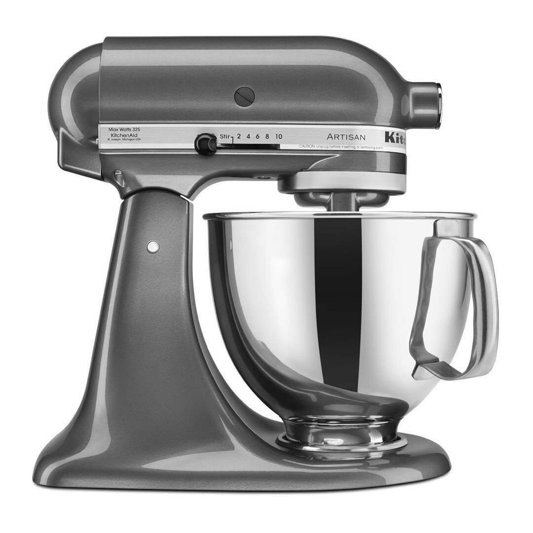


As a Senior CFM Specialist inside the Color Finish Material Lab of the Whirlpool Corporation’s Global Consumer Design, my responsibilities include leading the KitchenAid Brand. Of the multiple products that KitchenAid produces, nothing has a higher profile than the iconic KitchenAid Stand Mixer. This mixer has been a Color & Design leader for the majority of its 90 year history.
The creation of the new finish Yellow Pepper was challenging. The criteria demanded a finish that was on-trend as well as consistent with the current KitchenAid brand strategy and finish palette. On top of those elements, I felt the time was right that a kitchen icon lead a color revolution. At the time of design and development, my trend forecasts and research reflected the global financial crisis and gloom of the ongoing recession. Finish forecasts predicted that muted tones and neutral colors would be the standard until the economy improved. This inspired the “Anti-Crisis” finish of Yellow Pepper. Although the finish underwent multiple iterations, each were driven by a simple one-word mantra: “HAPPY”. Knowing that people around the globe were looking for a ray of sunshine, I took a Stand (Stand Mixer), against the growing economic storm clouds.
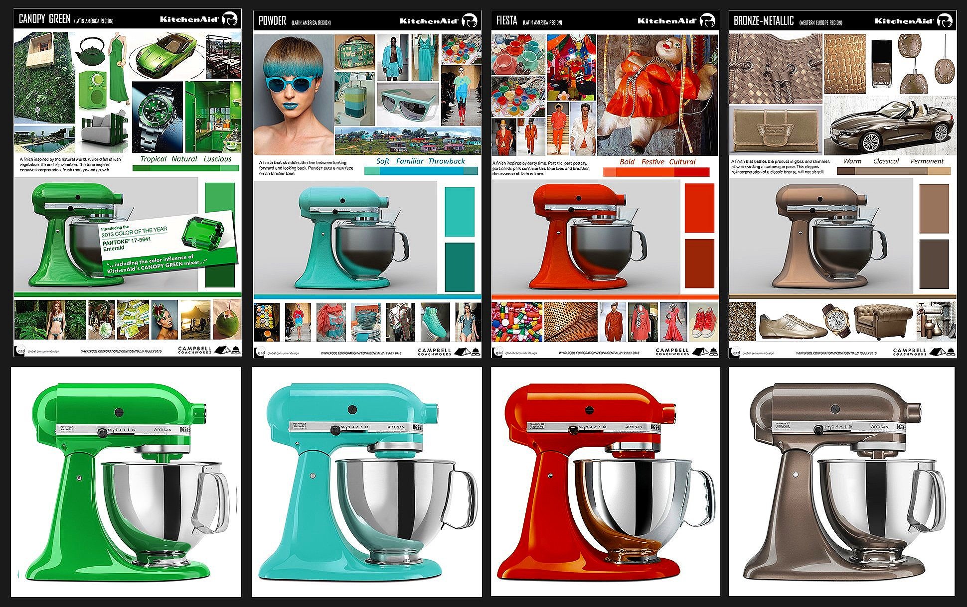
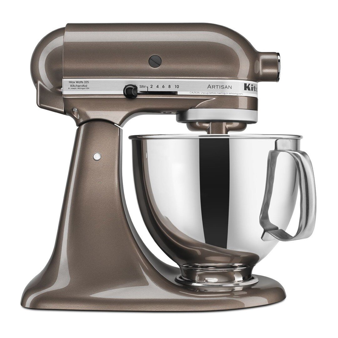
Project: KitchenAid Stand Mixer finish: “Metallic Bronze” The Stand Mixer has been an icon for over 90 years. In that time the product has been a sales success around the globe. Traditionally marketed as an American product with colors that appeal to the North American consumer, this project a Limited series that shifted the sales approach to a global market. “Metallic Bronze” was designed for the WER (Western Europe Region). Inspired by the history, the culture, the art & architecture of Europe. This is a finish that bathes the product in a satin shimmer while striking a statuesque pose, This elegant reinterpretation of classic bronze will not sit still.
Project: KitchenAid Stand Mixer finish: “Canopy Green” Traditionally marketed as an American product with colors that appeal to the North American consumer, this project was instrumental in shifting the approach to a truly global market. “Canopy Green” was designed for the LAR (Latin and Southern American Region). This part of the world is covered by vegetation that envelopes the natural landscape. Inspired by the lush shades of green of the Amazon rainforest. This color is associated with rejuvenation, life and prosperity. A shade of green that immediately resonates deeply within the people of this region, Results: The Canopy Green KitchenAid Stand Mixer was praised by the Pantone Institute as inspiration for “Emerald” the 2013 PANTONE COLOR OF THE YEAR.
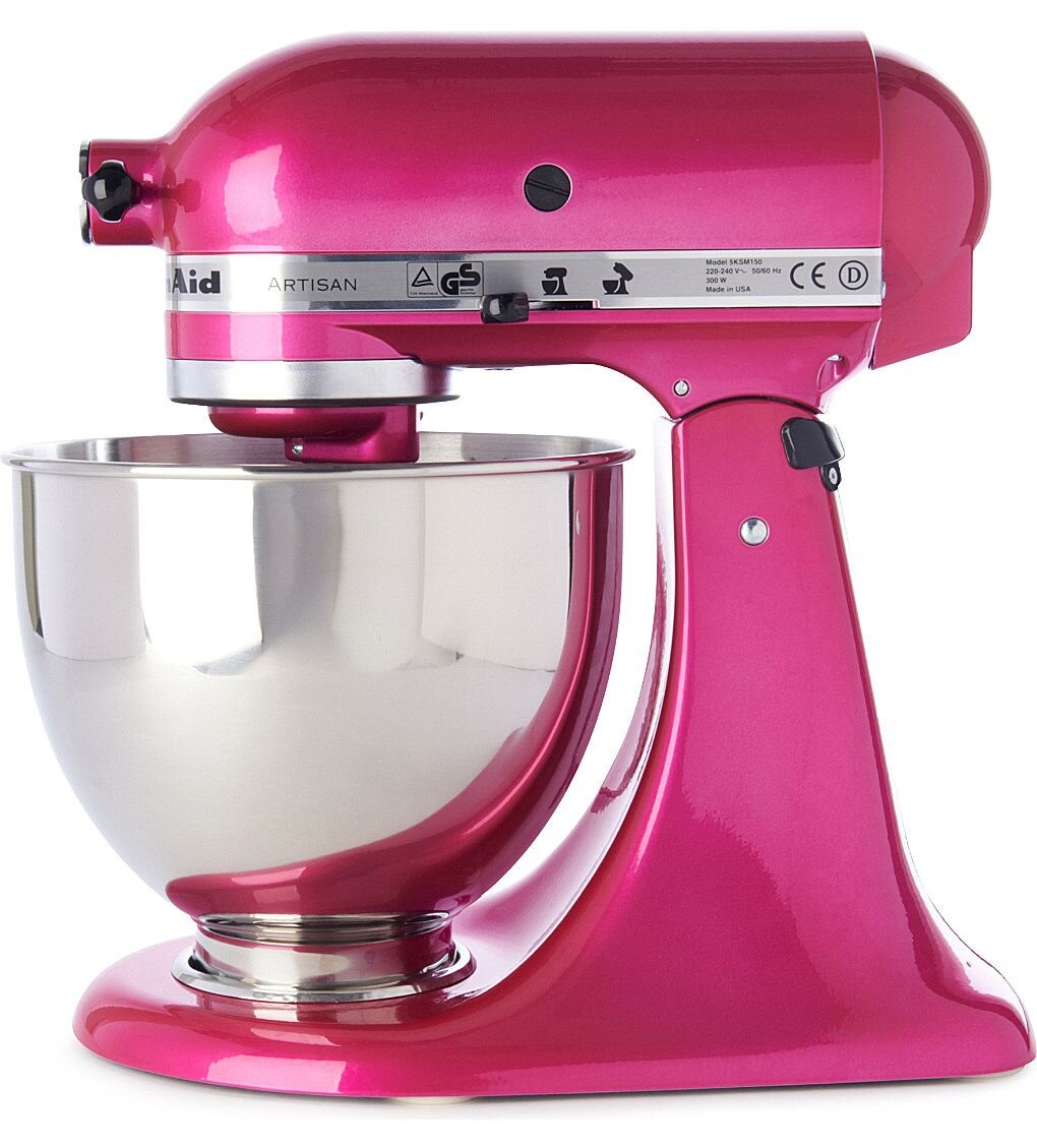
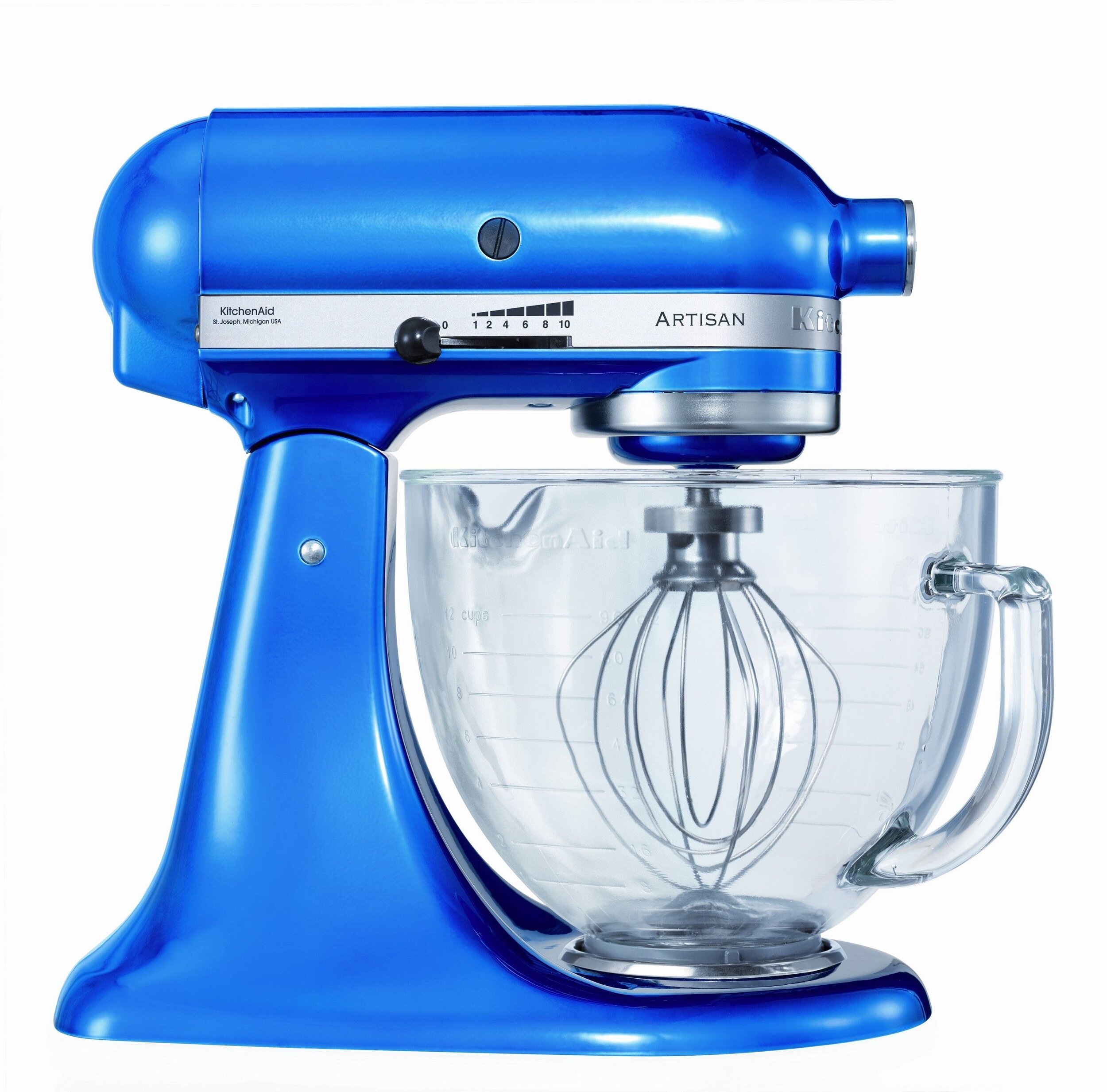
KitchenAid, Whirlpool Corporation Project: “Electric Blue” & Raspberry Ice” candy colored finishes: Involvement: Capitalizing on the sales success of the “KitchenAid 90th Anniversary Candy Apple Red Special Edition”, These two tint coat style finishes went looking to add high end automobile style finishes to the Stand Mixer Artisan Design product line. The “Electric Blue” finish was designed to have a masculine appeal akin to a 60’s racing Shelby Cobra. “Raspberry Ice” was inspired by pink paint color originally worn by a vintage Plymouth Hemi Cuda.